Two legacy tools.
One modern platform
built from scratch.
Before CCS+, United Airlines pilots managed their schedules across two separate tools: a legacy internal system and a third-party app called Crew Companion. Both were non-responsive, built on 90s-era UI patterns, and deeply frustrating to use. Neither communicated with the other, forcing pilots to constantly context-switch to complete a single workflow.
United's answer was CCS+, a single, modern, mobile-responsive platform built in-house to replace both. I joined the project from day one, before it had a name, when the team was still designing and building the foundational components from scratch.
The Trade Center is the most critical and highest-traffic feature of CCS+. It is where pilots trade trips, pick up open trips, manage requests, and check schedule legality.
"Before CCS+, the tools were so outdated that pilots had to switch between two separate apps just to complete one task. There was no trust in the system. They were scared to click things."
I flew to Houston, Denver,
and Chicago to find out
what pilots actually need.
I traveled to Houston, Denver, and Chicago, sitting with pilots, watching them use the legacy tools and early CCS+ prototypes, and listening to what made them hesitate. What I found wasn't just a list of feature requests. It was a trust problem.
Pilots would hover over a button and pause, visibly unsure whether clicking it would trigger something irreversible. They were not confused by the interface. They were scared of it. That shifted everything about how I approached the design.
The key insight was that experience level changed everything. Frequent traders had muscle memory and tolerance for ambiguity. Infrequent users had none of that. They needed explicit signaling, clear reversibility, and visible confirmation at every step. Designing for both meant building a system that was efficient for power users without being intimidating for everyone else.
From requirements
to shipped code.
Every CCS+ feature followed the same four-stage process: A repeatable system that increased speed while maintaining alignment with the broader product and user experience.
Before sketching anything, I read the user story carefully, then had direct conversations with the business analyst, stakeholders, and the lead designer. The goal was to surface ambiguity early. What does done actually look like? What constraints exist that are not written in the ticket? What are stakeholders optimizing for versus what the user actually needs? Misalignment at this stage is far cheaper to fix than misalignment after designs are presented.
I sketch fast and broadly, getting every possible direction out before evaluating any of them. The point is volume and rapid iteration. The early trade board sketches below show this: multiple layout approaches for the same dashboard, different ways of surfacing the engine run timer, different structures for the calendar and pay summary.
Before moving a sketch into Figma, I check it against four things simultaneously: Does it solve the actual user story? Does it align with existing design standards and Orion components already in the app? Is the technical lift reasonable given the sprint scope? Does it fit the page or flow it needs to live in? If a direction fails more than one check, I go back to sketches rather than investing in a Figma mock that will get rejected.
The strongest sketches go into Figma for higher-fidelity exploration. I iterate until the design is ready to present, incorporating feedback from design review and stakeholder sessions before final approval. On CCS+, I also implemented approved designs in Angular and SCSS, which meant I caught edge cases before engineering did and resolved them in the same sprint rather than opening new tickets.
Early sketches
These are from the earliest exploration phase of the Trade Board, before anything went into Figma. You can see the dashboard structure being worked out, the engine run timer concept forming, and the timeline color-coding system for seniority windows taking shape.
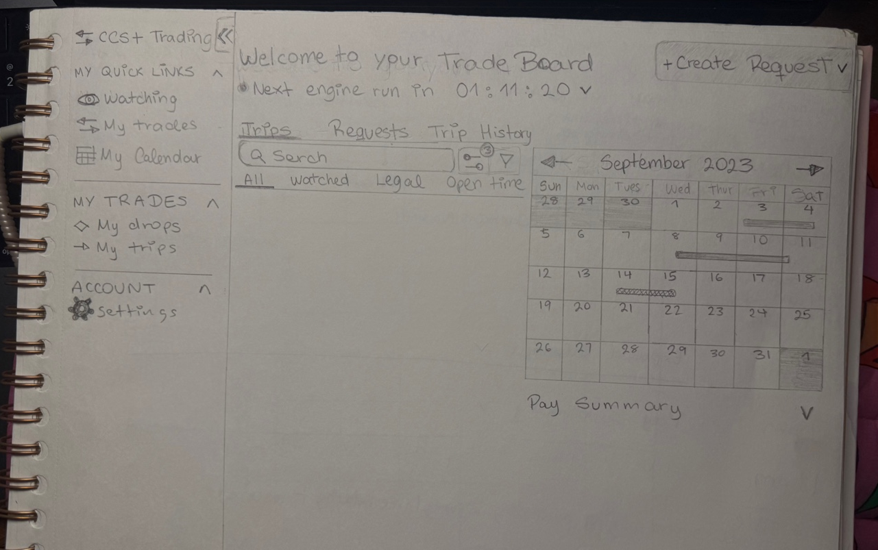
Trade Board overview: navigation structure, trade pool table, and pay summary accordion taking shape in first pass.
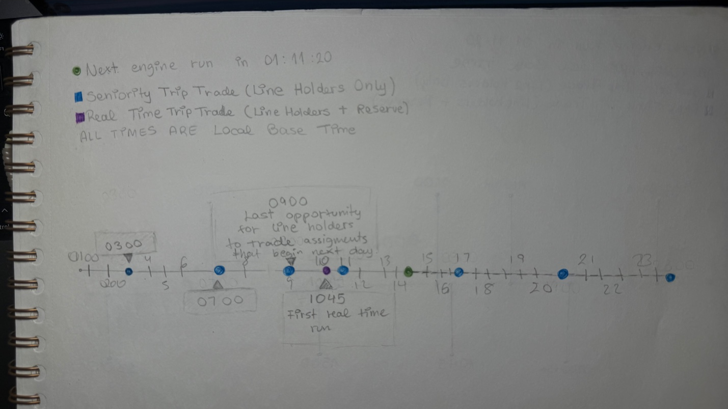
Engine run timeline with color-coded seniority windows: green for all pilots, blue for line holders only, purple for reserve windows.
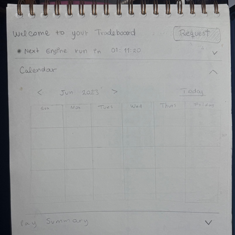
Calendar layout iteration: exploring how to surface pay summary, engine run info, and schedule in one scannable view.
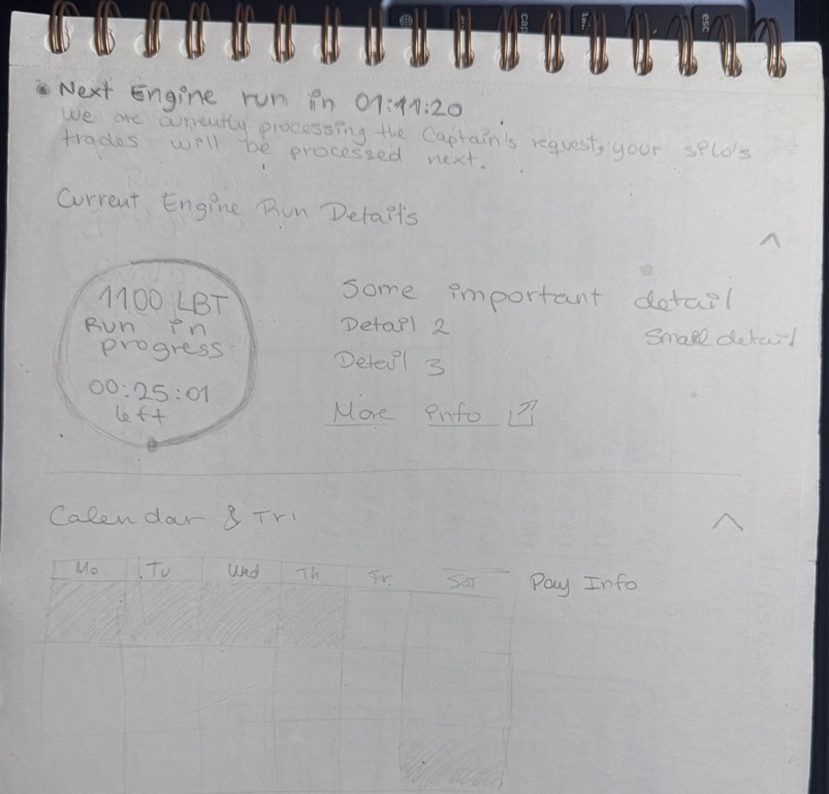
Engine run detail state: in-progress timer, processing message, and next-run scheduling details alongside the calendar view.
From legacy chaos
to structured clarity.
The before state was visually outdated. It had no information hierarchy, no visual language for trip data, and no way to scan across multiple items efficiently. Every screen required the pilot to read, not scan.
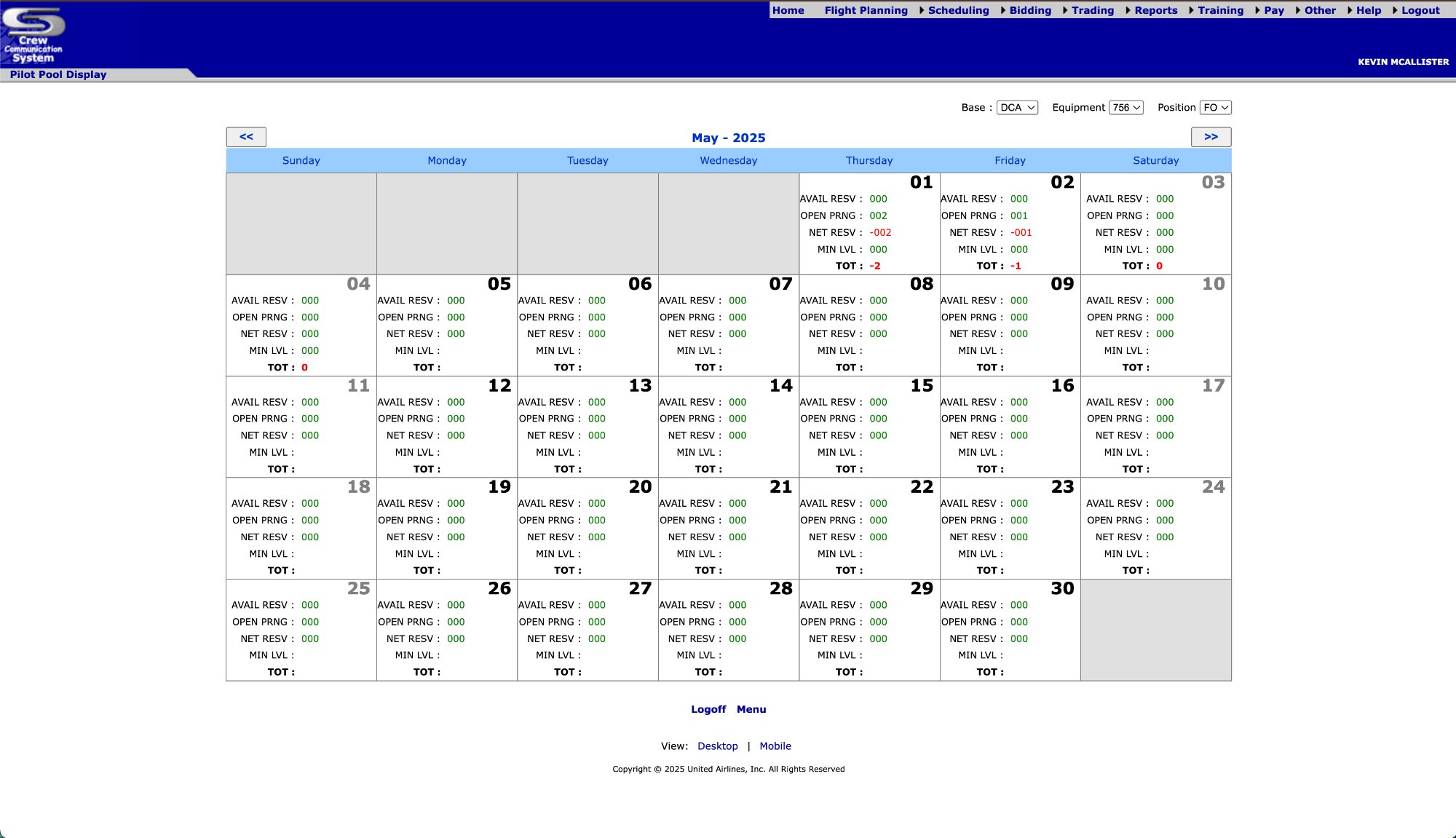
Dense legacy table, no visual hierarchy, no data prioritization, no trip visualization.
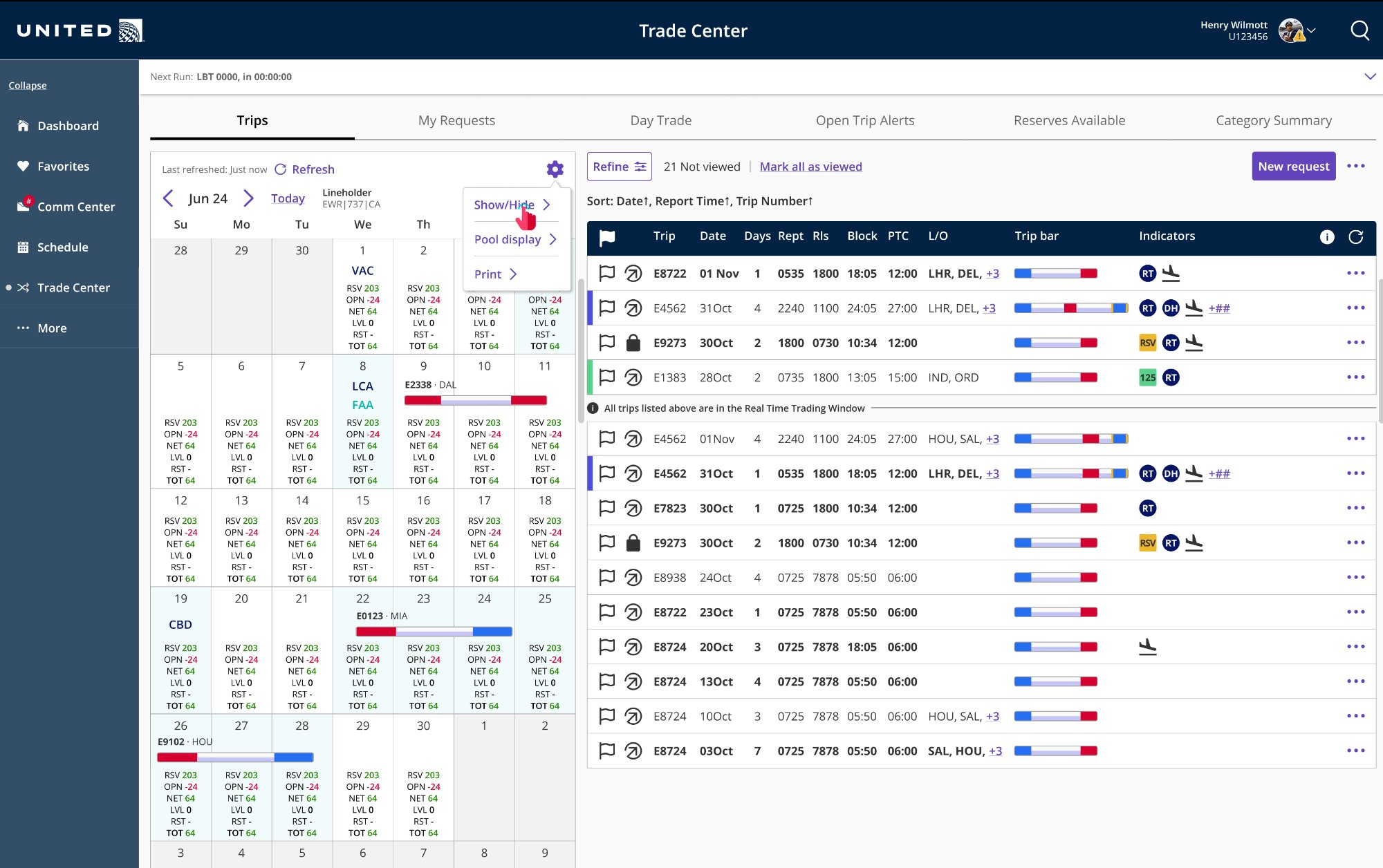
Modernized Trade Center with visual trip bars, horizontal and vertical scroll to surface all data in a single row, and clear hierarchy.
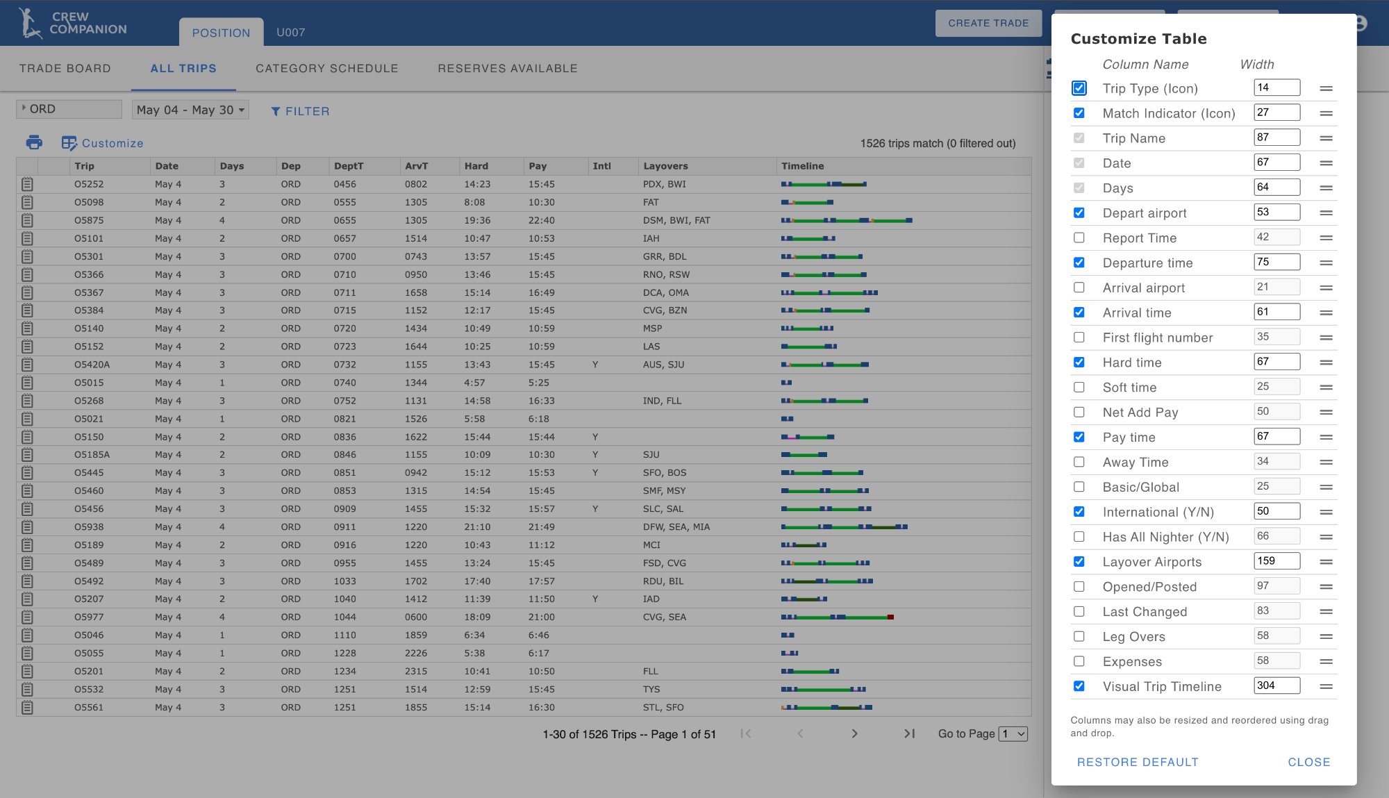
Static column configurator with no live preview and minimal usability.
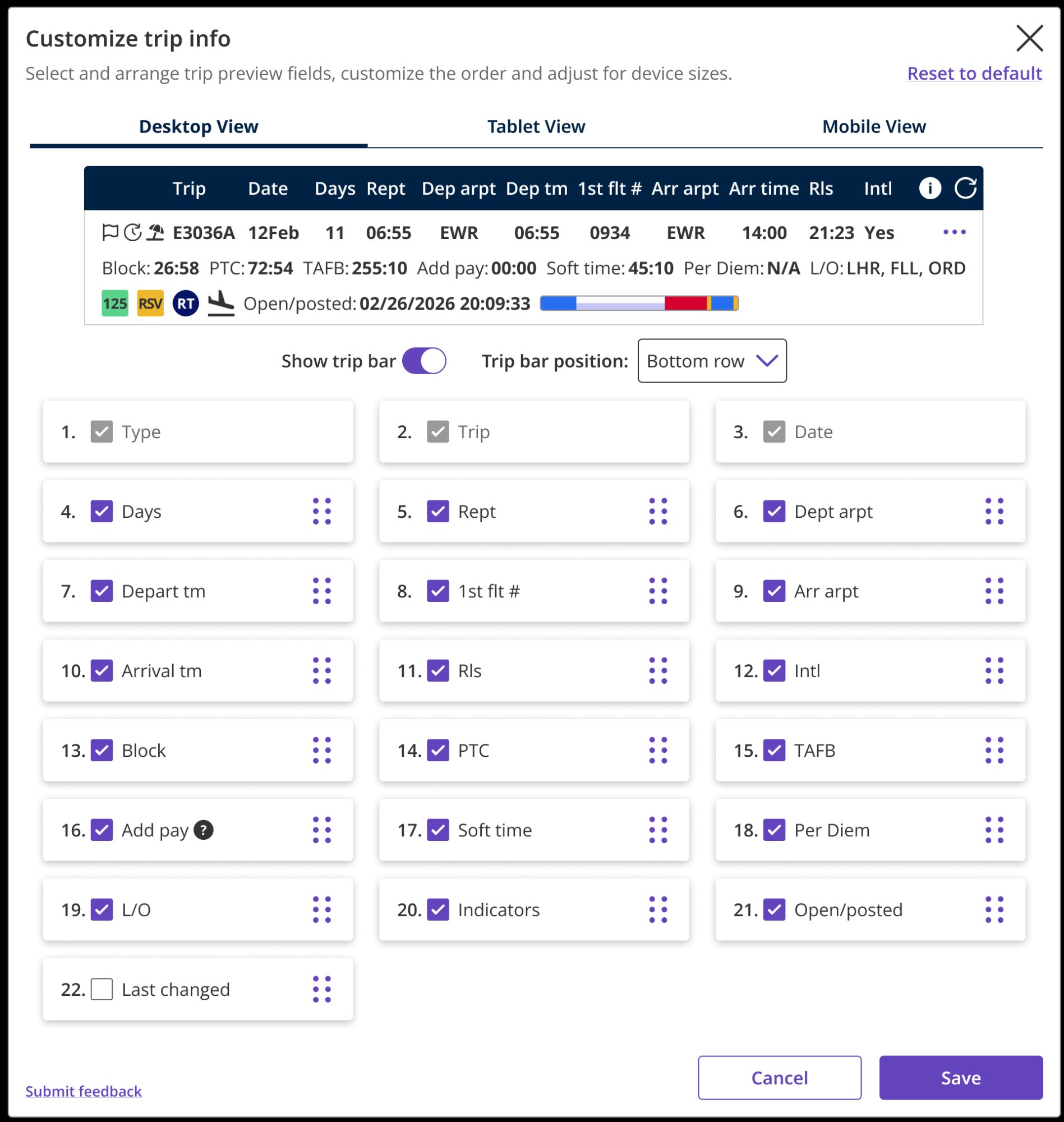
Live trip bar preview, drag-and-drop column reordering, multi-breakpoint support, reusable template component shared across multiple views.
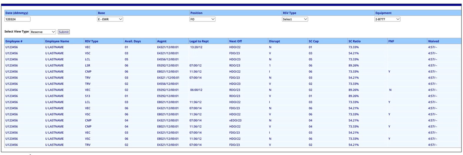
Raw data dump. No grouping, no visual structure, no way to orient quickly by date or position.
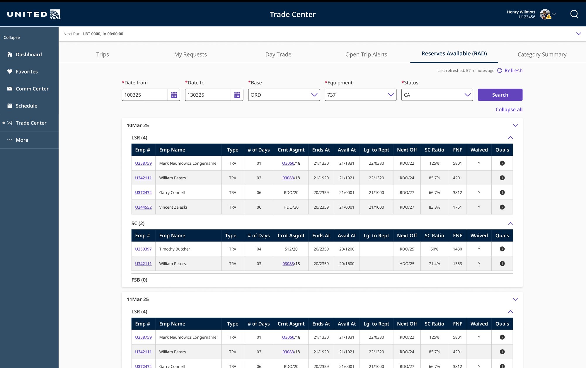
Date-grouped, collapsible sections, searchable filters, consistent with the table system used across CCS+.
The decisions that
mattered most.
Every major decision on CCS+ had downstream consequences. The platform shares components across features, so a change to one pattern ripples through the entire system. These were the calls I made or advocated for that had the biggest impact.
Designing inside
real constraints.
CCS+ was built on an established design system, with an engineering team managing complex backend business rules, a compressed timeline, and stakeholders with strong opinions and limited UX fluency. Navigating all of that simultaneously was part of the job.
All UI was built using Orion, United's official design system for internal apps, as well as with Angular Material components aligned to Orion standards. Change requests that required new component variants meant frontend rework, backend integration changes, and regression testing everywhere those components were used. We frequently redesigned within existing constraints rather than requesting new components.
Trip trading is governed by union contract rules, FAA regulations, and United's scheduling logic. A pilot can only be awarded a trip if it's schedule-legal, and "legal" involves dozens of overlapping constraints around rest periods, flight hours, and position qualifications. Every UI decision had to account for these rules without overly-surfacing their complexity to the pilot.
Decisions affecting 15,000+ pilots were sometimes made by a single stakeholder acting on personal preference rather than user data. We worked to counter this by bringing user testing findings into design reviews, documenting rationale formally, and proposing phased releases that let us validate with real users before committing to large changes.
CCS+ was one of several concurrent projects. I was simultaneously working on FA CCS features, the Trade Board Engine Admin App, and a Pilot Messaging App. I prioritized high-impact workflows across these initiatives, balancing user needs with technical constraints. This required making strategic tradeoffs and focusing on the most critical functionality to ensure meaningful features were delivered despite evolving scope.
Driving end-to-end design
across CCS+
CCS+ was a large, multi-team initiative spanning 30+ contributors. I drove design across several concurrent workstreams, owning key features end-to-end and contributing to shared systems and patterns used across the platform.
| Feature / Area | Notes |
|---|---|
| Trade Board Pool Display redesign | Led end-to-end redesign and implementation, improving clarity of trip evaluation and reducing decision friction for pilots. |
| New Request complete overhaul | Redesigned from scratch, streamlining request flows and improving usability across key pilot workflows. |
| Customize Trip Modal | Designed interactive modal with live preview and drag-and-drop reordering, enabling flexible trip customization and reusable patterns. |
| Admin Communications App | Drove design from discovery to delivery; mentored a junior designer and established patterns for internal communications workflows. |
| Trade Board Engine Admin App | Designed a data-heavy admin tool from scratch, enabling scheduling teams to audit and manage complex trade logic. |
| Orion Design System CCS+ extensions | Extended design system patterns to support Angular-based constraints, contributing reusable components and dark mode adoption across CCS+. |